Farmers Insurance District 24
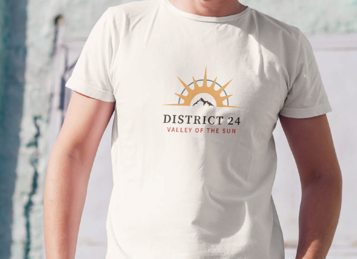
This brand concept was for Farmers Insurance District 24 and aims to show they are a welcoming place that values community and growing together as a team. The logo for this concept keeps the half circle as a reference to the Farmers Insurance logo but is comprised of a sunrise and mountains in the middle, referencing their location in Arizona. The colors also reference the warm desert or sun, giving it a friendlier feeling. While the serif typeface was chosen to help keep a professional look.
Branding

